Script font family for elegant display use
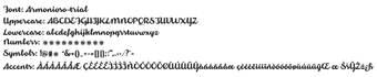
Armonioso, designed by Zetafonts, is a modern script font family intended to give digital and print projects an elegant, handwritten tone. It supplies connected, curvy glyphs and a vertical calligraphy rhythm that preserve readability while delivering a fluid display voice for headlines and logos. Use cases span social media graphics, wedding invitations, and signage, and the family targets graphic designers, brand creators, and hobbyists seeking refined script typography.
Who designed Armonioso and what drives its look?
Armonioso comes from an Italian foundry, created by Cosimo Lorenzo Pancini and Francesco Canovaro under the Zetafonts umbrella (Studio Kmzero). That provenance explains the font’s deliberate balance between calligraphic motion and digital discipline: the designers intended a script that reads as handcrafted yet lays out predictably in composition workflows used by professional studios.
How does the font behave compared with decorative brush scripts?
The family emphasizes legibility over chaotic brush textures, using creamy, fluid strokes that keep shapes distinct at display sizes. This design choice makes the font better suited to branding and signage than to long passage text. For projects that require a handwritten tone, the font reduces the risk of unreadable letterforms common in looser decorative scripts.
Does Armonioso integrate with common design workflows?
The font runs across mainstream desktop environments; it’s compatible with Windows, macOS, and Linux and is usable inside Adobe Creative Cloud apps, Microsoft Office, and web design tools that accept standard font files. That cross-platform support makes it straightforward to include Armonioso in logo comps, social artwork, and exported PDFs without special toolchains.
How do you install and license the family for projects?
Installation is direct for desktop workflows
Armonioso suits display-focused design with typographic care
With 200,000 downloads reported on DaFont, Armonioso is a widely distributed script choice for designers targeting headlines and logos. Begin mockups at print sizes and on-device previews to verify stroke weight and spacing, and pair the font with a neutral sans for extended copy. These steps help preserve legibility when the script is used in brand materials and packaging.